Friday, May 6, 2011

46) Illusion of Motion by Multiple Image

When an image is multiplied and placed overlapping itself in different poses or in succession of each other, a sense of motion is conveyed. 

http://people.rit.edu/andpph/photofile-misc/strobe-motion-ta-08.jpg


 Our mind automatically perceives this image and turns it into a moving image of the girl in our mind, rather than just multiple still figures.


45) Illusion of Motion by Blurred Image

Movement is obviously not still.  Without advanced shutter speed on a camera, a moving object will appear blurry.  A blurred figure is assumed to show motion because we constantly see things like cars zooming past us on the highway, consequently only looking like a big colored blur.

http://www.picturecorrect.com/wp-content/uploads/2010/04/motion-blur.jpg


We can tell this photograph shows motion since all of the people are blurred as they bustle around the station.

44) Illusion of Motion by Repeated Figure

Movement can be suggested with figures seeming in the act of motion or placed in an image in such a way that we assume movement has occurred.

http://images.nationalgeographic.com/wpf/media-live/photos/000/014/cache/horse-in-motion_1429_990x742.jpg


By seeing the horse repeatedly in different positions of running, we can mentally picture the full act in motion.

43) Anticipated Motion

This can be achieved by showing images that have potential energy.  They are in the act of moving or look as though they may perform some sort of action.

http://2.bp.blogspot.com/_7djeIHzuM2c/S8IaTaYoPhI/AAAAAAAAAIE/qZjH6PNtQt8/s1600/motion_figurecropped:anticipated.jpg


 We can almost feel the girl jumping through the air about to land in the water.

42) Spacial Puzzles (Equivocal Space)

Normal and natural spacial cues are ignored to create an interesting image, which are no realistic in depth or space when looked at closely.


It is impossible for the stairs in this drawing to realistically do what they are doing but the space and depth was manipulated to create this spatial puzzle.


41) Multiple Perspective

Looking at an image from more than one point of view creates multiple perspective.  All of these different views are combined into a single image.

 http://www.kvl.cch.kcl.ac.uk/wall_paintings/crypto/perspective/crypt_rs_pers.jpg

There's no way a person standing in one specific place could see all of the different parts of the building in this image, but multiple views are combines, making it possible to show more parts of the structure.

40) Amplified Perspective

An amplified perspective points an image directly at the viewer, so the forefront of the image is at eye level and it moves back farther away.

http://redvest.typepad.com/boggled/vegas_eiffel_tower-thumb.jpg

 The bottom of the Eiffel Tower in this image is pointed directly at the viewer.


39) Illusion of Space by Linear Perspective

"As parallel lines recede, they appear to converge and meet on an imaginary line called the horizon, or eye level."  So, the closer together these lines get, the farther away they must be.

http://rourkevisualart.com/wordpress/wp-content/uploads/2007/03/linear_perspective.jpg http://www.dartmouth.edu/~matc/math5.geometry/unit3/0301.jpeg


The lines all converge on the archway showing the sky in the second image and to the end of the hallway in the first because they progressively get closer together and recede to some sort of final point.

38) Illusion of Space by Aerial Perspective

Value shows depth in light and dark contrast as well as contour contrast.  The farther away it becomes, the less distinct contours are and contrast between values become.

http://media-2.web.britannica.com/eb-media/94/4794-004-BF9D685F.jpg


As the lines move closer to the background (farther away) lights and darks grow closer in value (more gray) and the distinction between contours of objects is almost impossible to define.

37) Illusion of Space by Vertical Location

Spacial cues are given according to the height or elevation of objects in an image.  Usually the higher up it is, the farther back it seems.

http://elizabethk.com/class4/wesselmann2.jpg

Since an object like the apple is farther up than the steak, we assume it to be farther bark on the table.

36) Illusion of Space by Overlapping

Placing certain objects behind or in front of others gives the illusion of spatial characteristics.

http://www.deshow.net/d/file/cartoon/2008-12/bob-ross-landscape-painting-281-2.jpg

Because the trees at the bottom overlap the water, and the farther away trees overlap the mountain, we can get a sense that the mountains are the farthest back and the trees at the bottom of the painting are the closest.

35) Scale Confusion

Purposefully changing the scale of objects to add interest or intrigue is scale confusion.


Mice are not the same size as people but this image is possibly more interesting because of the scale change.
 

34) Alternating Rhythm

images repeat in a regular order but are alternating in subject matter or a characteristic of some sort.

http://fajita.biz/wp-content/uploads/2010/10/shishkabob.jpg


These shish kabobs are an alternating rhythm since the meat and vegetables regularly reappear but in an alternating pattern.


33) Progressive Rhythm

Rhythm that involves repetition of a shape, but in a non-static manner.  It is a somewhat sequential progression.

http://bandcamp.com/files/19/34/1934541126-1.jpg


While the string lines and the frets of the guitar are repeated, the color on each one progressively gets brighter and bluer, and decreases in size.


32) Absence of Focal Point

This sis used to emphasize the entire surface of an image, usually achieved through repetition.

http://www.utdallas.edu/~melacy/images/Krasner02.jpg https://blogger.googleusercontent.com/img/b/R29vZ2xl/AVvXsEiH6kwbHH2yqjpQSF7q-hQv-ekvp8YyQa9t0kimmPjkkX4TmLc5UNLqvo3wMWACZ0N1AlraPmVLQJfMMUeUTCPP4aIffZzR0Z4DANne2hRNjDuJGePqib9lPfDxDcFSRgPOVdR9JTpuKuYm/s400/05.JPG


Neither of these images contain overpowering objects that draw the eye specifically to it.

31) Degree of Emphasis

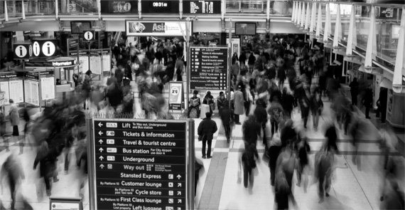
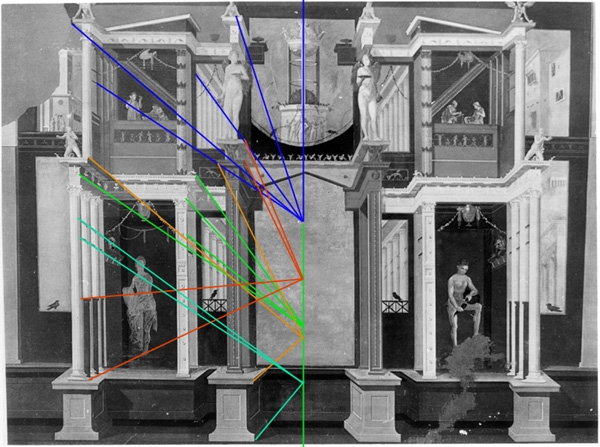
Even if there is one pretty strong focal point, other elements may be placed as important focal points also, even if not the major one.  Sometimes, "the focal point has the role of attracting attention so that we then take more time to absorb the remaining elements of the piece."

http://www.september11news.com/PeopleMagazineCover.jpg

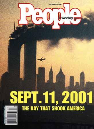
We see the primary focal point (the yellow "SEPT. 11, 2001") first due to its color contrast against the black background, and is made so because of the story's importance.  The secondary focal point is the "PEOPLE Weekly" since that's the name of the magazine, obviously important for sales.  The tertiary focal point is the background picture of the Wold Trade Center towers in September 11th.


30) Emphasis by Placement

The placement of certain lines or objects that all point to one thing can make that certain thing the focal point.


http://upload.wikimedia.org/wikipedia/commons/b/ba/John_Trumbull_001.jpg

All of the soldiers are gesturing towards or pointing to the one man on the ground, causing him to be the resulting focal point.

29) Emphasis by Isolation

The eye's attention is naturally drawn to isolated objects.  When there is a mass of objects placed together and one lone object placed elsewhere, it's almost impossible not to look at the isolated object.

http://www.fanboy.com/archive-images/ChristinasWorld.jpg

The woman in the first image, and the cat ahead of the rest in the second are both isolated from the bulk of objects in the scene, and are therefore emphasized. 
 

48) Emphasis by Contrast (size)

When there is much to look at in a painting, contrasting sizes can identify a focal point, and draw emphasis on that object.

http://img.artknowledgenews.com/files/FranciscoDeZurbaranSaintHug.jpg

Since the man dressed in brown in front of the table seems a great deal smaller than the rest of the men and objects in the painting, the smaller man is emphasized.  There is even a value contrast even further emphasizing him as he is wearing a dark color as opposed to all of the white and lighter colors throughout the rest of the painting.


27) Crystallographic Balance (Allover Pattern)

There is an equal weight or eye attraction everywhere in the image.  No main focal point is established.

http://soul-amp.com/pics/pics_mindedelic_flower_rainbows/flower_collage_mindedelic_flower_rainbows2_smaller__soul-amp.jpg
http://thelongthread.com/wp-content/uploads/2008/03/butterfly-collage.jpg


No one butterfly or flower outshines another in these two pictures.  There is an equal amount of attraction from one thing to the next.

26) Radial Balance

Elements are circled around some sort of center.  

http://www.heliosfera.blogger.com.br/Georgia%20O%27Keeffe%20The%20Shell.jpghttp://www.myfreewallpapers.net/artistic/wallpapers/georgia-o-keeffe-white-flower-on-red-earth.jpg


In both of these Georgia O'Keeffe paintings, there is a center point, and radiating elements extended throughout.


Thursday, May 5, 2011

25) Asymmetrical Balance

In this concept, dissimilar objects or similar visual weight are placed to achieve a balance.  It may not be a mirror image, but there is still a balanced feeling.


http://www.steveartgallery.se/upload1/file-admin/images/new21/Felix%20Vallotton-549668.jpg

While there seems to be more objects and a heavier weight on the left side of the room, the light value of the woman's skirt on the right side of the room aids in providing an asymmetrical balance.

24) Symmetrical Balance

In this form of balance, similar shapes are replicated on either side of a vertical axis in the same positions.  In essence, it's a mirror image.

http://yourdecoratinghotline.com/wp-content/uploads/2010/09/art-white-pewtersage-blogspot.jpg

This room is almost exactly the same on one side as it is on the other.
 

16) Value as Emphasis

An emphasis or focal point can be created through the use of light and dark values.  Sometimes the majority of an image will be dark with one very light object, drawing the eye's attention to that lighter object.

http://www.1st-art-gallery.com/thumbnail/67417/1/St-Roch-Asking-The-Virgin-Mary-To-Heal-Victims-Of-The-Plague-1780.jpg

Throughout the painting there are mostly darker, dull colors. However, Mary in the top left hand corner is illuminated by a bright yellow burst behind her, and more brightly colors clothes, drawing the eye's attention straight to her and her Son. 
 

15) Value as Pattern

Value can be used to express pattern with either contrasting or similar values.  Light and dark create some sort of repeated theme.

https://blogger.googleusercontent.com/img/b/R29vZ2xl/AVvXsEjLlOxHBIHybd-WoPG1kR6E-NneagVDmQwuAyqOyBB8HhlgKNuIkzzXPtmcfI6wPQ5I3qBzeJIYA3I1NUKoKjdo52-7R-IqtApClrtUaraWbnvK2fCCwHCYkJdwKQS8TfsO3VscHYwsQgk/s1600/valuestudy11.jpg
 Here, the different levels get progressively darker as they descend, blending with a different square each time.


14) Curvilinear Shapes

In opposition to rectilinear shapes, curvilinear shapes are more natural looking with curves and less straight angles.  They appeal more irregular and free-form.

http://www.sydneyarchitecture.com/ROC/ROC006-Sydney_Opera_House_Sails.jpg

The Sydney Opera House has a very curvilinear design while the upper part of the building lacks many straight lines.

13) Rectilinear Shapes

These shapes contain right angles and rectangular planes.  There are straight edges and sharp contours.

http://photos-6.idxco.com/102744c126a7d4a375cabc74bfee065a482985104

This building contains no curves or natural shapes.  There are only straight lines and right angles.


12) Nonobjective Shapes

Nonobjective shapes have no subject matter suggestion and no object reference.  Rather than the outline of a flower or a person-like shape, there may be randomly places squares and rectangles, lines, or organic shapes.

http://www.treadwaygallery.com/ONLINECATALOGS/March2004/paintWEB/0697.jpg

 There is no identifiable shape or specific story behind this painting, it merely contains an arrangement of geometric shapes.


11) Abstraction

Another type of distortion is abstraction which simplifies objects to a basic shape, ignoring most specific details.

http://www.glamcheck.com/archive/images/stories/stories/Designers-Corner/Fashion-Glossary/Fashion-Glossary-A/Fashion-Glossary-A-Abstract-art.jpg

There are obviously a sun, female, and two trees featured in this picture, abstracted to lack fine details and stripped down to a basic outline. 

10) Idealism

Idealism is a more specific type of distortion that depicts something more perfect than what it naturally is.  Any flaws are corrected.

http://www.faculty.de.gcsu.edu/~dvess/ids/slides1/mic_pieta.jpg

 This represents idealism because the Virgin appears to be very young, about the same age her son who is laying in her arms.  Michelangelo may have sculpted her this way to show her timelessness, but nevertheless, it is unrealistic in an idealistic way.
 

9) Distortion

In distortion, an artist deliberated alters or exaggerates the characteristics of something, setting it apart from it's natural form.

http://www.friendsofart.net/static/images/art2/pablo-picasso-jacqueline.jpg

This Picasso painting exhibits distortion among the woman's facial features and body parts.  Some are smaller or larger than others or placed somewhere it naturally wouldn't appear.

8) Naturalism

Naturalism is achieved by accurately reproducing an image as it appears in nature.  The copy of the image should look most exactly like the real thing.

 http://www.artchive.com/artchive/l/leonardo/monalisa.jpg

The Mona Lisa represents naturalism in that the proportions are accurate with natural standards.  Nothing about her is distorted and she seems to be three-dimensional as she would be in reality.


7) Lost and Found Contour

Emphasis is placed on the value and color of a line.  There are visual clues that suggest a certain shape or object and our brain automatically fills in the rest.

 https://blogger.googleusercontent.com/img/b/R29vZ2xl/AVvXsEjWSSxglE4CRYO_OvqsISV837fgJ57C1nKosqs7Jq9zDYv3LRxHSEZAiyyeGya2JEHdBHXzpGW2vqits5PwGeuCD3oZsvYbtUZmwrOJVIqisLMHKjbt3hYLrZfyofhI_lNEKg5fcIToIu7g/s1600/Caravaggio,+Calling+of+St.+Matthew.jpg

This painting features some men sitting around a table.  While we can't see the enitrelty of some of their bodies, we still know that they are there.  Take the boy sitting on the bench, hunched over.  There is an illuminated spot where the top of his thigh should be but the rest of his leg is hidden in the dark contrast.  We know, though, that it is there.

6) Line as Value

Line as value describes different techniques using the placement and value of lines to create a sense of volume in a subject, rather than just a flat outline.

https://blogger.googleusercontent.com/img/b/R29vZ2xl/AVvXsEhirkvDMDo_w3f5QAabZ0CifNlSAsIar79EDWXqzlELRN48kM8QeZE_ekKhvXFnQcYRQOB73-1eTefT3mjCFHnwtooGfPHKR5ri8cjCSOOjaMOLnosO2F4UZ8Et6h6p8vkYKIV6F88iFLw/s1600/goltzius.jpg

By using a cross-hatching technique, lines are placed in such a way where contrast is clear.  Lighter areas require less lines than the darker.